Bezeq |
In 2001, there was a large gap between the public’s perception of Bezeq and the reality of how the company had evolved
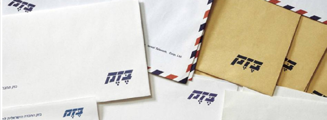
Bezeq was viewed as a monopoly; it was highly unpopular. People remembered the company as it was in the days when service was slow and poor, and it was regarded as a slow-paced landline telephone company.
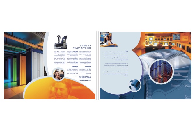
In reality, however, Bezeq had developed considerably in terms of technology, and offered a variety of services including international phone calls, corporate solutions, internet services and more. Additionally, the level of customer service had greatly improved. (‘It’s a Privilege to Serve You’).
Moreover, the mobile network operators were transforming into Bezeq’s competitors, even in areas where Bezeq had previously been the sole player. Cellcom, for example, had begun to offer corporate services.
Bezeq understood it had no option but to undergo a large-scale branding process, in which all options were on the table for discussion, including the name “Bezeq”.
There was much concern over whether to stay with the name Bezeq or choose a completely different name.
It was decided that despite problems with how Bezeq was perceived, the brand name was still an asset, that of a large, professional, well established and widespread Israeli company.
However, simply keeping the Bezeq name and altering the visual marketing of the brand would have been insufficient to change perceptions about the old Bezeq.
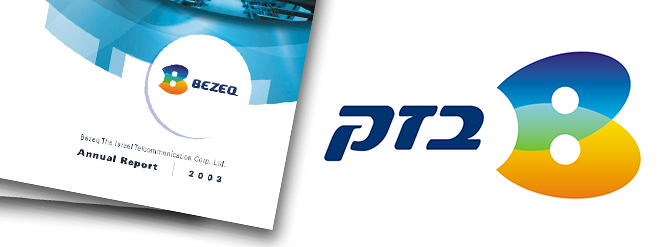
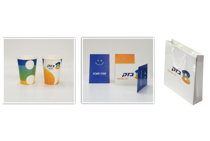
And so, the idea of an integrated concept was born – to add the “B” icon, representing the new Bezeq.

The addition of the Latin letter “B” had several meanings:
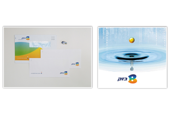
First and foremost, it infused a spirit of modernity into the brand, a spirit more akin to the computerized, web-based world.
Secondly, the concept created a recognizable icon. The icon could be seen to comprise, for example, two interconnected disks.
Moreover, the sound of the letter “B” also contains the meaning “to be”.
The range of options and services offered by the new Bezeq was expressed in the colorful rainbow – blue, green, orange and yellow. The cool colors reflect the brand’s technological aspect, while the warm colors express its customer service and personal touch.

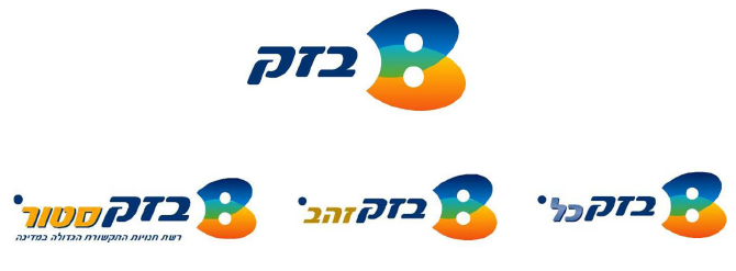
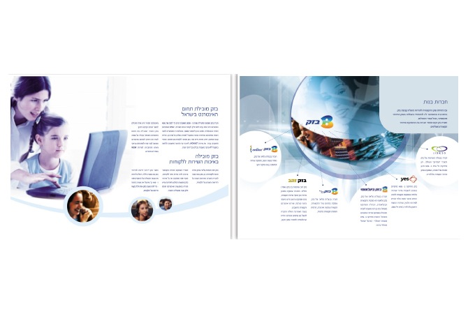
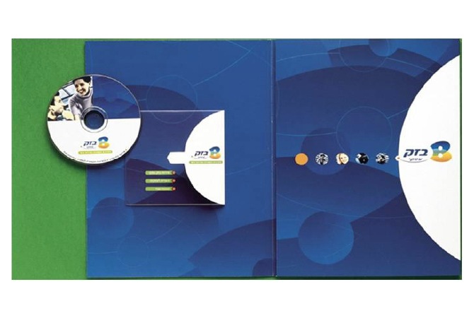
With regard to the brand architecture – the relationship between the brand and its sub-brands, such as Bezeq International, Bezeq Gold etc. – all were united under the “B” icon.
This created a powerful synergy. Bezeq’s services and divisions were empowered under the super-brand.
The super-brand enjoyed much greater exposure thanks to the visibility of the sub-brands.

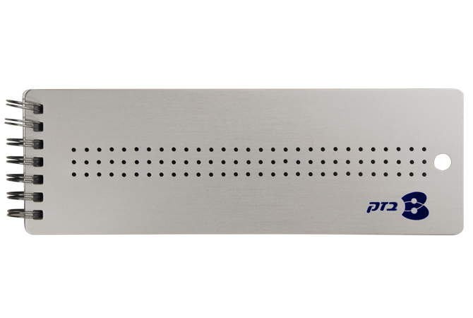
Years later, even though Bezeq decided not to use the colors anymore, it retained the “B” as its representative icon.
Consumer perceptions of Bezeq have changed – today it is an accessible, forward-thinking brand, part of our daily lives.
We created a strategic approach to further develop the brand language and turn Pelephone into B Mobile, the private division into B Home, and the business division into B Business. This did not come to fruition.