Tara |
In 2009, the two main players in the brand category – Tnuva and Strauss – overshadowed other brands with their dominance on refrigerator shelves.
This dominance, coupled with a significant investment in resources, enabled the brands to attempt a dangerous conceptual status quo in the category, which could have pulled the rug out from under Tara and its market relevance.
The Tara brand had to contend with a host of image problems. It was seen as an outdated and insufficiently reliable dairy and also as low quality, despite the innovative developments and successful moves that demonstrated its expertise.
The brand’s main difficulty was that despite a small group of loyal customers, it could not break the barrier of indifference among the general consumer population.
The basic dairy products market is characterized by an automatic buying pattern, whereby a consumer chooses “his cheese” or “her milk” without stopping to look in the refrigerators.
It was clear that a profound change was needed to create a real sense of relevance in a market dominated by impulse and stiff competition, and to break the consumers’ automatic buying pattern.
We had to bring a new product line to the market. The Tara brand had no choice but to reinvent itself.
To transform Tara’s relatively small size into something unique and advantageous, and to show the consumer a new story.
Unlike Tnuva and Strauss, two major corporations with diverse operations, Tara deals exclusively with cow’s milk and it’s products.
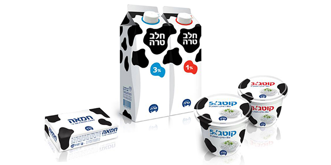
So the first thing we recommended was a change of brand name from Tara to Tara Dairy.
Tara has been living and breathing its dairy expertise for over 60 years. The meaning of this lies in the dairy’s focused, unbiased and uncompromising expertise in the production of basic dairy products.
The branding solution rests on the understanding that to produce excellent quality basic products, what is needed first and foremost is high quality milk.
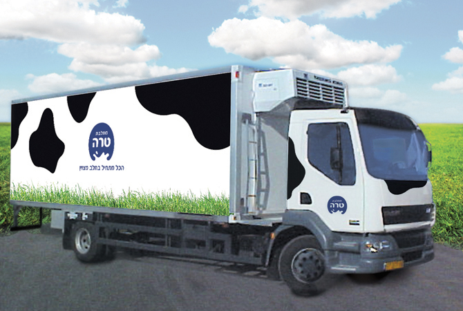
We distilled this insight into a sharp, strategic statement that aligned with our design solution: Tara Dairy – Everything Starts With Fine Milk.
We further understood that consumers yearn for a sense of simplicity, of returning to their roots. We realized that consumers are far less threatened by products that offer intimacy and a human touch, rather than an industrialized “conveyor belt” image.
For these reasons, our solution really spoke for itself – however, we must stress the importance of Tara’s courage during such a transformative process, not something that companies undergo lightly.
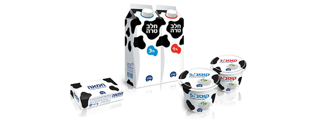
The idea was to “paint” the whole brand with black and white spots, the icons of the dairy cow. This would produce a complete world of associations based directly on consumer perceptions: proximity to the source, freshness, green meadows, quality, nature, goodness, personal touch and simplicity.
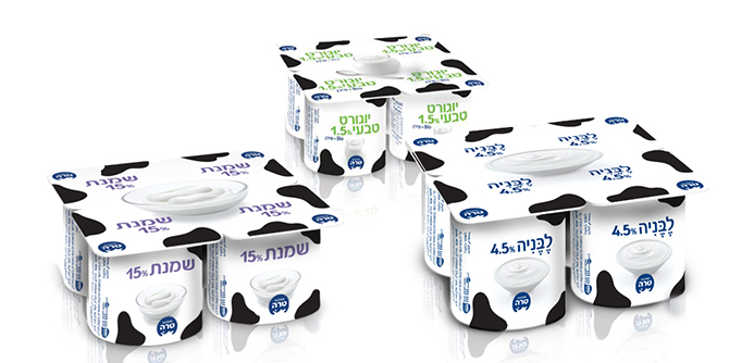
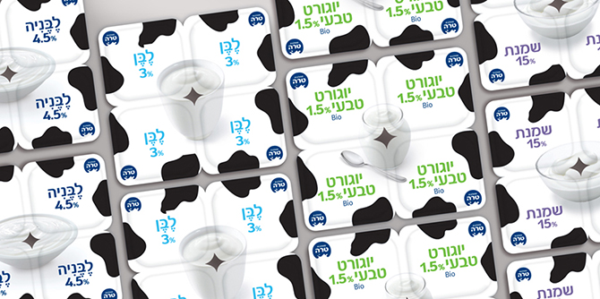
The graphic solution achieved prominence and was clearly visible on the shelf both as a single group of brands, but also as a differentiating statement an as a design line connecting all the various categories.
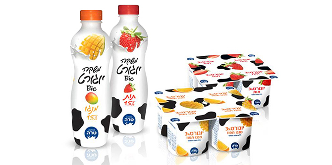
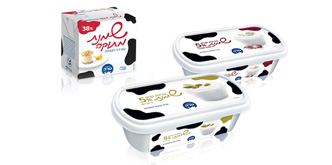
For a company with minimal shelf presence compared to that of its competitors, immediate brand recognition and strong shelf impact is essential for success.
The process was exceptionally successful, both quantitatively and in terms of image. The entire terminology of the media discourse surrounding the Tara Dairy brand was irrevocably changed.
Tara was no longer a stagnant, marginal brand feeding on crumbs from the two dairy giants – instead it was proactive, tenacious, active and youthful.
The branding process marked a clear boundary between the “old Tara” and the “new Tara”. The brand became the talk of the day, and created a shockwave that ricocheted off its competitors.
The dissonance between Tara’s image before the process and the leadership role it adopted afterwards was the electric shock that jolted the brand to an ever-higher conceptual level. The entire dairy scene was thrown into a defensive position, prompting a reevaluation of its key players’ strengths.
At the same time, the branding process redefined the category by removing the emerging threat of market dominance by two brand giants without any real competition.
The process shook up the brand category, and it made Tara Dairy the second-biggest player in three core categories (milk, cottage cheese and cream cheese). This took place during a recession when the competitors only managed to maintain their strength, or even became weaker.
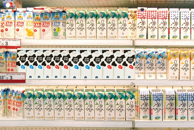
In parallel, the move prompted a real revolution on supermarket shelves – and this in a market segment defined by the status quo, even though there were ostensibly plenty of changes (one ‘Milki’ pudding more, one ‘Milki’ pudding less…).
In terms of the quantitative results, the rebranding process saw a growth of between 10-30% (depending on the product) of market share.
