R3 | sex

Over the last decade, the Israeli condom market was totally controlled by the Durex brand, which almost became a generic term for condoms and enjoyed the perceived value of professionalism.
Studies showed that although the R3 brand was of an even higher quality, it was perceived by consumers as being less reliable, and somewhat childish, while also conveying heavy and antiquated associations – exactly the sort of things that a condom brand should not be.
As a result, the aim of our rebranding process was to consolidate and update the R3 brand’s outdated image, while launching a new product line that would help set the company on track to becoming a trusted, desirable, distinct and trendy brand.
The brand’s most important value is safety.
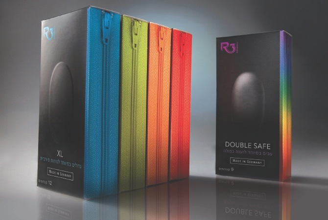
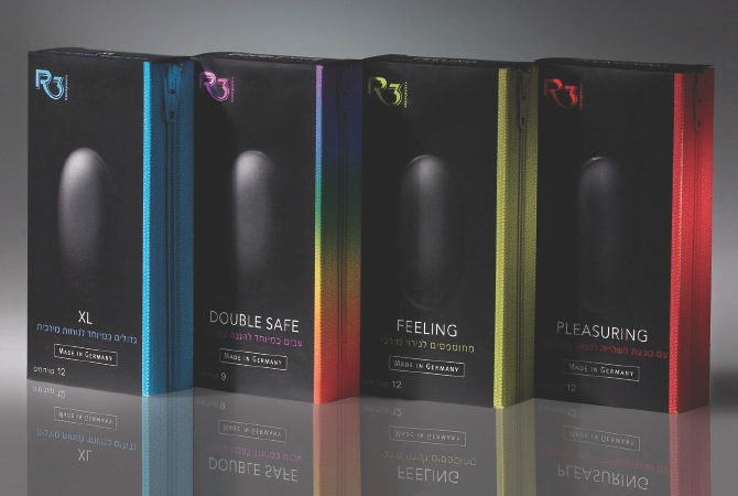
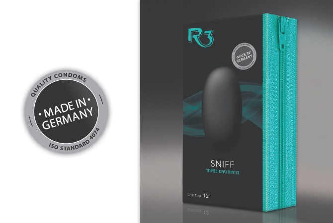
In order to reinforce this value, we aimed for a clean, meticulous design. Moreover, as R3 condoms are manufactured by Germany’s leading condom company, we decided to make it clear that the brand is “Made in Germany”, a message that encourages a sense of reliability and safety.
Most condom brands are highly colorful. We opted for black, which projects a sexy nighttime atmosphere that begins for the consumer even at the moment of purchase. Mysterious and seductive, black has a self-confidence that stands out on the shelf.
And if we’re talking about things that stand out – the main, playful motif on the packaging is that of a (real) bulge sticking out of the package and reminiscent of, say, a bulge in the trousers.
Another motif is that of the side zipper on the packaging, which adds to the brand’s fun and impulsive aspects, and which offers a colorful element that distinguishes between the various types of condoms.
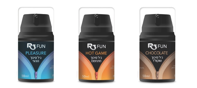
In our design of R3 Fun – a series of lubricants from the R3 brand – we expanded the sensual ‘night’ language used on the condom packaging design. However, on the condoms we left the zipper motif closed, while on the lubricant packages the zipper is open.